For every big improvement or high-profile new feature that’s rolled-out for the Jostle platform, there are a handful of smaller, under-the-radar changes that quietly slip in, sometimes completely unnoticed. Well, today we’re going to shine a light on a few of these recent hidden little gems. The mark they make may be small but their effect on your overall Jostle experience can be very big.
Activity
Replies
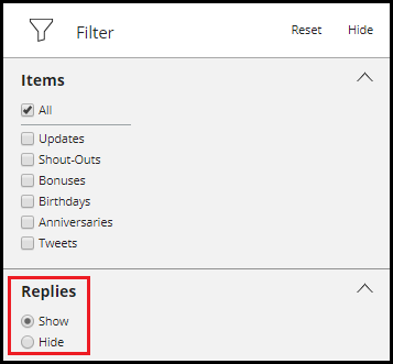
While the Thread link has been replaced with the more transparent View all replies link, the biggest little change in Activity can be found behind the scenes. Click on the filter icon at the top of Activity and you’ll notice there’s a new filter heading—Replies —with two options listed: “Show” and “Hide”.

That’s right, you can now instantly clean up your Activity feed by hiding anything that has been posted as a reply to a Shout-Out or Update. This can also come in handy as an on-the-fly filter (for example, if you need to scroll back through the feed to find a particular Update on the same day half your organization has posted replies to someone’s birthday announcement).
Discussions
I know, it seems like we just did a run-down of the newest improvements in Discussions not so long ago (because we did), and yet here we are again. Well, it’s no mistake, because now there are even newer new improvements in Discussions! A whole bunch, in fact:
New member added
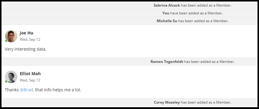
This simple change helps people hit the ground running after being added to an ongoing Discussion. Previously, any new Member would be added right at the beginning of the Discussion timeline, meaning they would have to manually scroll down through all the past posts until they caught up to the current ones.
But now when new Members are added, they’ll be inserted into the timeline right after the most recent post—setting them up to dive directly into the current conversation without having to suffer through any marathon scrolling beforehand.

Jump to latest
Addressing a similar timeline problem, “Jump to latest” is a button that will appear at the point you navigated away from a Discussion if newer posts have been added while you were away. For those who don’t want to read any of the posts they missed, this gives them the opportunity to leap frog over them right to the most recent one.
Typing Indicator
The typing indicator has been given a dynamic upgrade as well. No longer is it the static indicator that appeared as someone started typing a response in a Discussion. Now, a personalized indicator will appear with a moving dot animation to signify when a person is typing a reply. And if they stop typing, the animation simply vanishes, providing everyone else in the Discussion with a real-time status of coming comments.
And that wraps things up for now. Hopefully this little handful of platform updates will help make some big differences in your day-to-day activities!

