4 min read
Is the org chart really dead? This question made us reflect on the core of any organization – its people and how they are, or aren't, organized.
By Bev Attfield
Aaron Dignan made the intriguing statement in his recent article in Medium that the “org chart is dead.” We asked ourselves if this were really true. It made us reflect on the core of any organization – its people and how they are, or aren't, organized.
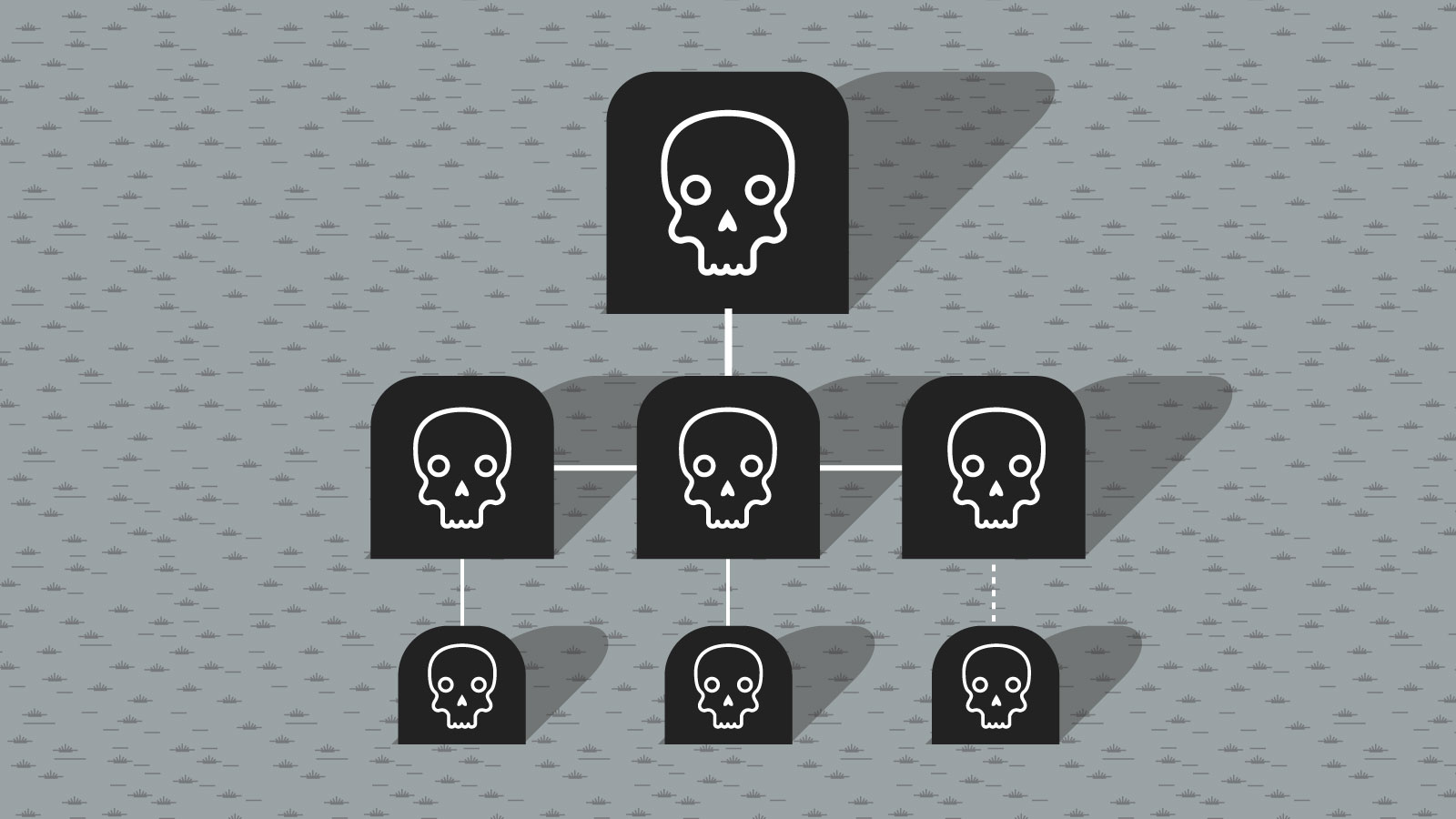
At one point in the history of American business, the organization chart was an innovation. The era of the org chart began in the United States around 1854, when Daniel McCallum began drafting them for the railroads he managed. In the age of strict command-and-control hierarchical management practices and very limited internal communications channels – largely paper or face to face – the system was pretty helpful. It allowed workers to understand the chain of command and areas of responsibility. In reading a single chart, any employee could understand how the company operated, their role within the company, and how to find the right person at the company.
As the rate of business change accelerated throughout the 20th and into the 21st century, however, the traditional org chart’s weaknesses began to outweigh its benefits. The tool became out of date. Even digitally published versions were usually laughably antiquated. In the absence of a reliable, formal org chart, people were forced into the internal informal information and action channels that the org chart was never designed to address in the first place.
While the value of the formal org chart has plummeted, the need to be able to find and identify the person responsible for a given task has shot upward. The need to understand decision-making and assemble cross-functional teams for problem solving and innovation has also sky-rocketed.
Organizations have become vastly more complex. Employees are more diverse and dispersed than ever. While the rise of digital communications has facilitated communication, it has also at times made it harder to get a definitive answer about policies, resources, and decisions.
Most organizations today have formal structures that constantly evolve as people join, move around, and leave the organization, and as the organization grows and reorganizes itself. While some of these are largely hierarchical, some are more matrixed. Other companies are hybrids of various models. Regardless of format, however, organizational structures are becoming more diverse.
In addition to these increasingly complex and shifting formal structures, most organizations are becoming dependent on even more fluid, even more complex, informal structures. These informal structures can include project-based teams, issue-based ad hoc assemblies, communities of practice, and knowledge networks. These informal structures are taking on even greater importance in highly responsive, innovative organizations.
How do we help modern employees enjoy the organizational clarity that 19th century employees gained from their org charts? We need a new model for empowering employees to navigate these formal and informal structures. We need technology that can visualize both – not just hierarchical, matrixed, holocratic or other formal structures, but also the informal, ever-shifting informal structures. Some have suggested – even attempted – to visualize a social-graph of an organization, hoping to solve the problem. But without the duality of the formal and informal, these graphs are less helpful than they let on.
The key things to understand about organizations is that they are:
A truly useful org chart will address each of these. Among the difficult technical hurdles over which a great org chart has to leap, the most challenging is that of visualizing the multi-dimensional structures of the modern workplace.
Few current tools designed to represent org charts have the capacity to show anything other than strictly hierarchical reporting relationships. Some have the ability to add “dotted-line” reporting for matrixed environments, but few can show ad hoc teams. Even fewer can let you see – in real time – which teams and roles a given individual is involved with. Fewer still are interactive – letting you easily explore how the various pieces fit together.
An equally significant and constant challenge is keeping org charts current. Most charts are drawn by someone in HR and based on whatever information they happen to have on hand. Then the chart is published, distributed or embedded into presentations rather than being connected to live data. Furthermore, only HR has the authority to change the chart. A manager who fires up a new cross-disciplinary team for a new project can’t add that to it. A person who changed title and role multiple years ago, and yet has never seen that updated in the HR database, has no 1-click recourse.
The best approach is to make the charts self-correcting. That is, they can automatically detect formal and informal changes – based on HR databases and communication patterns – and can be corrected by employees and management alike. Together this creates a new generation of org chart that is as faceted, nuanced, and organically evolving as the organization itself.
Jostle’s intranet grew from a kernel of insight our founders had about org charts. They understood that organizations needed a more fluid and responsive way to build their internal structures. They developed technology and user experience based on the idea that there are usually multiple types of relationships in an organization, and that they are all equally important to understand.
People have always been at the heart of Jostle’s innovation, design, and development. Jostle developed a patented technology called TEAMS® which allows the platform to represent a wide variety of organizational relationships. These relationships can be edited and explored in a simple, interactive visual interface. Even better, these same relationships can be used to identify the right people to contact, a key part of Jostle’s magic.
If you need all line managers to participate in a discussion, all sales staff to see some news, or even all part-time employees in North America to gain access to a certain link or resource, TEAMS technology makes the task very simple. With people at its core, Jostle helps people work with people so that organizations can thrive.


Read more by
Bev Attfield

Jostle’s employee success platform is where everyone connects, communicates, and celebrates at work. Find out more at jostle.me. © 2009–2024 Jostle Corporation. All rights reserved.